Role
UX/UI Designer
Skills
UX Research, User Flow, Wireframes, Visual Design, Branding, Prototyping
Software
Figma, Adobe Illustration, Adobe Photoshop
Overview
Courte is a mobile application that offers the city of Vancouver a comprehensive solution to facilitate the use and sharing of public tennis courts by enabling users to find the closest parks with available courts, manage queues and connect with nearby users to play together.
The goal of this project was to solve a problem faced by many tennis players in Vancouver and it started with the question: “How might we improve the use and share of tennis courts in Vancouver parks?”.
Check this project’s website and documentation at www.courte.app.
The Problem
In-person arrangements to share public tennis courts in parks are not practical for all the players and do not offer enough direction for new or insecure players.
Tennis players in Vancouver may not know about all of the public tennis courts available to them and how busy the court is. Additionally, these spaces are normally operated on a “first come, first serve” basis, which works just fine when dealing with a small number of players but as the player count increases, problems can arise.
Without a system, it is almost impossible to manage the use of courts in Vancouver parks and provide visibility to all public tennis courts.
User Research
To have a better understanding of the challenges faced by the players, user research was conducted. The research involved:
- • Contextual inquiry with visits to parks and tennis courts in Vancouver
- • Collection of players’ reviews of the use of parks in Vancouver
- • Investigation of Facebook groups from tennis players in Vancouver
Some insights from players that used tennis courts in Vancouver parks are highlighted below.
“Nice courts, but so tough to get a spot. Everyone is quite aggressive with grabbing courts.”
“[courts] Can be busy. Gotta get your elbows out to get a court sometimes. Watch out for sneaky people trying to get more time on courts.”
“Nice place to go play tennis for free. It would be nice to have some digital displays where players can punch the time when they start playing and others can see if they have played the half-hour that they should to let others play. Some are very rude and always lie to newcomers and say that they just got there, when they have been playing for hours.”
User Profiles
The insights from the research made it clear that there are different types of players in the parks, which were categorized into three user profiles based on their goals and frustrations.
Frequent Player
Plays frequently and knows a lot of places with tennis courts, but usually just goes to the same one even if it involves waiting a bit more for their turn. They like to play at every opportunity to engage with the community.
Goals:
Find people to play together when he’s around the park.
Frustrations:
Feels pressured to leave by the other players waiting in line.
Casual Player
Plays casually and knows some places with tennis courts. Prefers to use spaces that don’t have lines and have a regular partner to play with. They don’t have much free time, so they need to plan ahead when to play.
Goals:
Find the closest park with available courts.
Frustrations:
Courts are always busy and the waiting time is unknown.
Newcomer Player
Plays casually and is new to the city. Doesn’t know where they can play and doesn’t have partners to play with. Doesn’t feel comfortable enough in the space and in the community.
Goals:
Discover places and people at his level to play tennis with.
Frustrations:
Doesn’t know how to use the public tennis courts.
User Stories
After analyzing the users’ goals and frustrations, I was able to define user stories—which were later used to define the features for the user flows and wireframes.
As a player…
I want to know which nearby park has an available tennis court, so I can plan my commute efficiently.
I want to be able to join the waiting line in a tennis court, so I know what is my position to use the space.
I want to find someone at my level, so we can play together.
I want to track my time in the space, so I know when I need to leave for others that are waiting to play.
I want to know when is my turn to play, so I can move to the court
I want to have quick access to status on my favourite spaces, so I can feel more motivated to go play.
User Flow and Wireframes
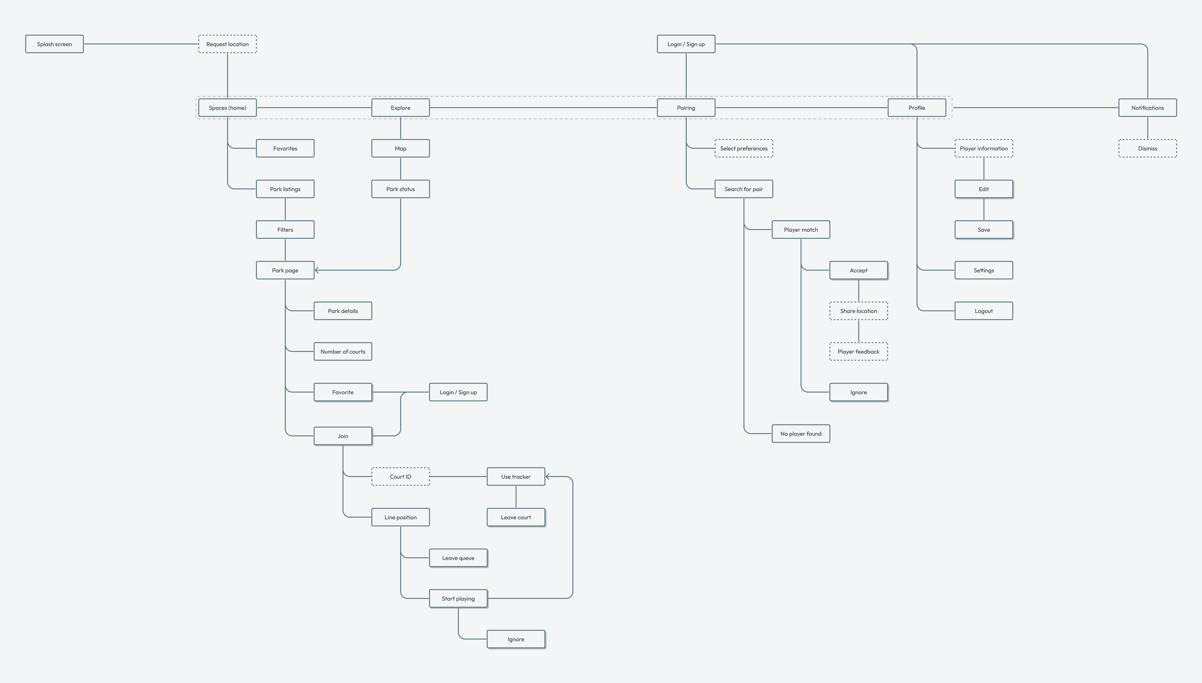
To start defining the interaction design and the information architecture of the app, I created a basic user flow. It was used to discuss with the developers and stakeholders, and gather feedback on the app features’ flow. Once we had adjusted and come up with an agreement on the features and how they would work, I created wireframes and documentation on how users would execute each user story.

Solution
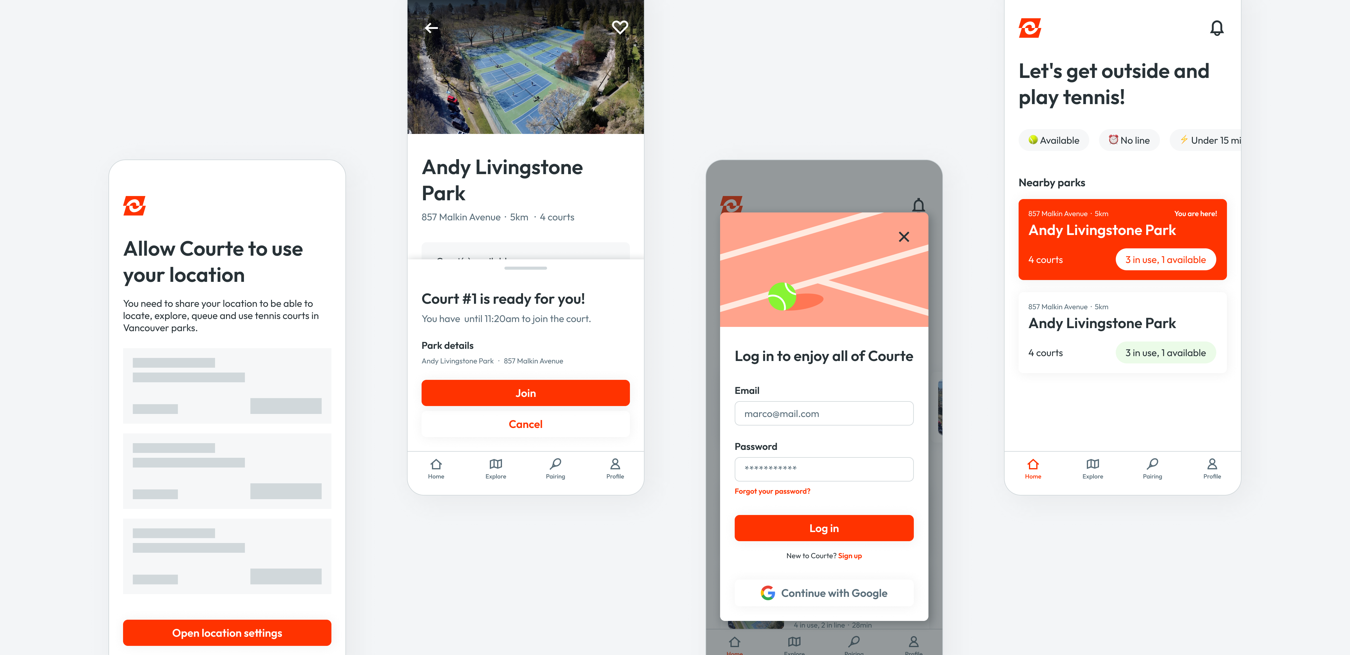
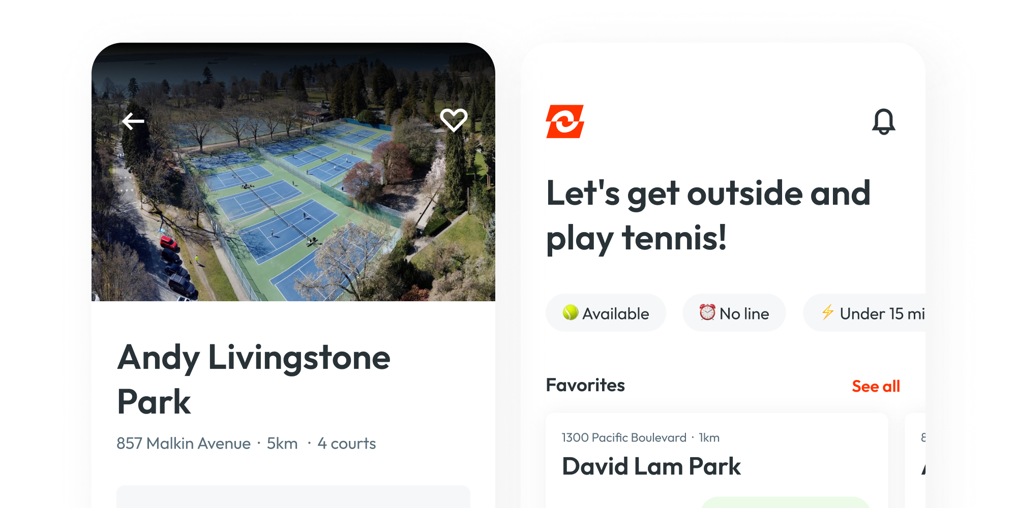
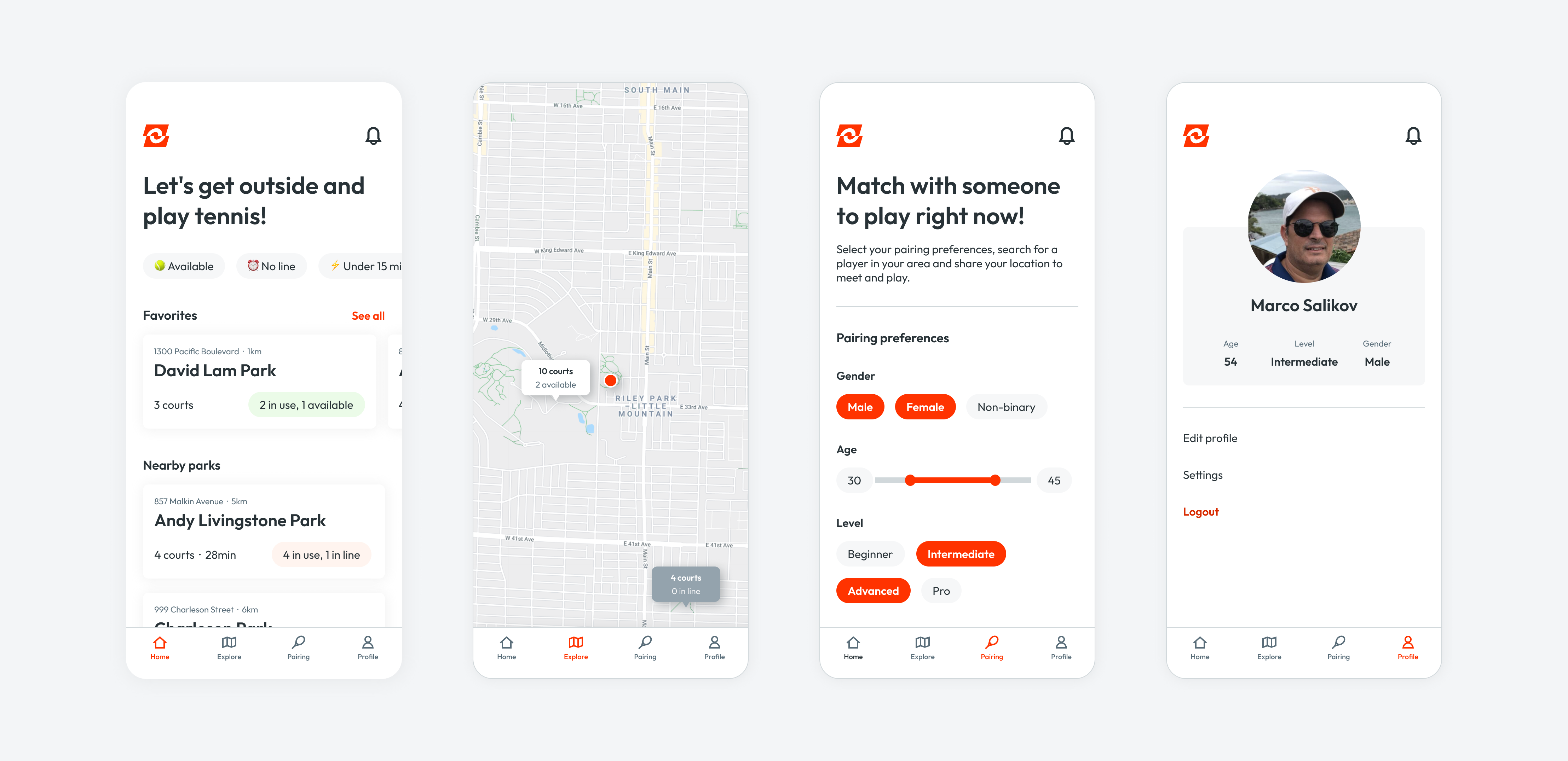
Courte allows users to view current wait times at Vancouver’s public tennis courts, get in the queue when they arrive at the court, track their remaining play time, and find other local tennis players to play with.
It displays all available playing options in their area, including those users may not have previously visited, ensuring optimal use of all of Vancouver’s public tennis facilities.
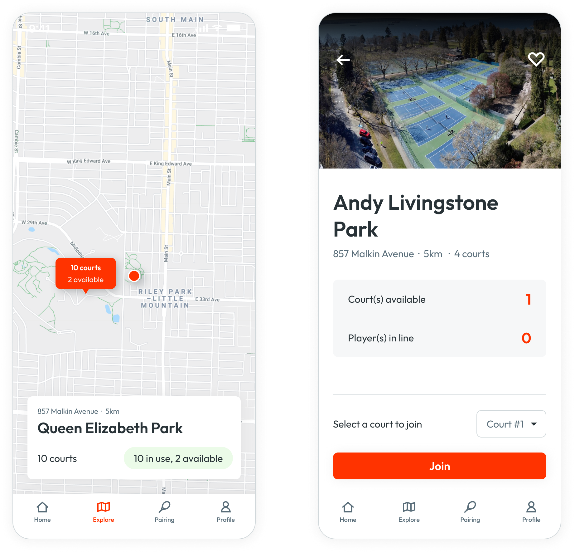
Find available courts
Players can view all public tennis court facilities in Vancouver, favourite them and check the current wait time for a court. With this core feature, they can save time by planning to visit the court with the shortest wait time and have easy access to all available court options in their community.
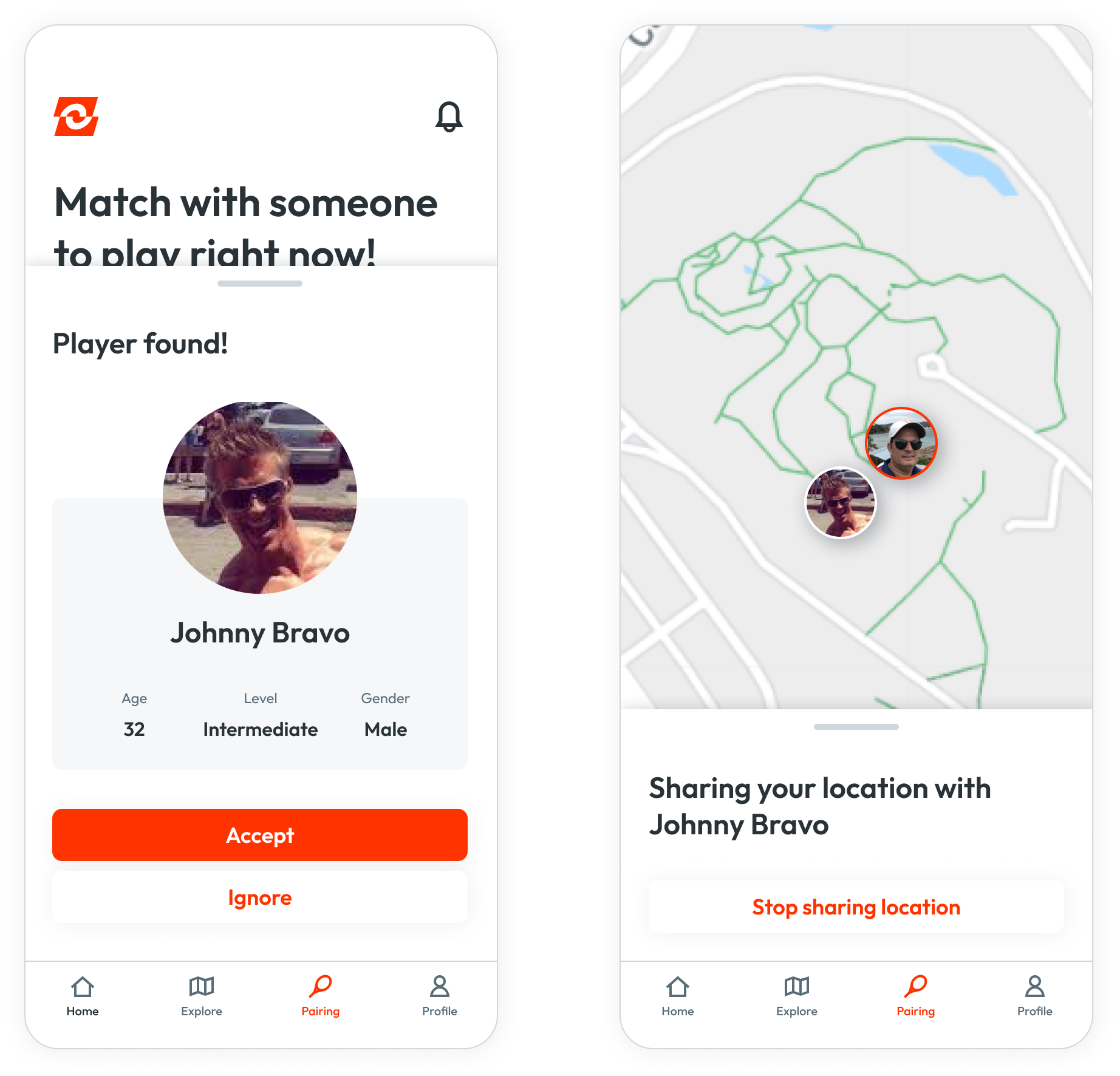
Pair with nearby players
The pairing feature helps players match with others players based on their preferences. After matching with someone, they will share their location with each other to meet to play and later on, decide if the match was good enough for them to play again with this person or not.
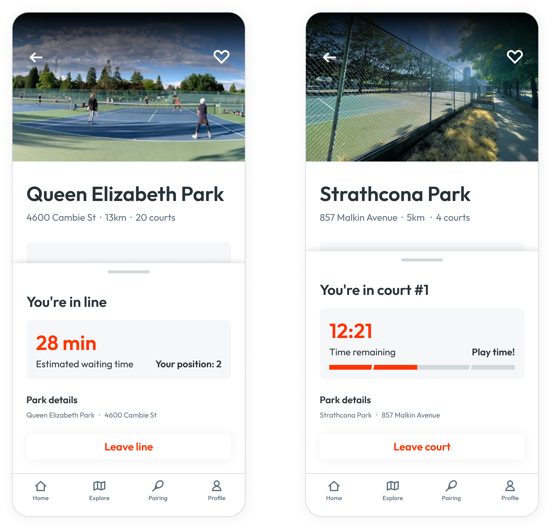
Queue and track play time
The check-in feature organizes the use by offering players an action to join the court in the app and track their play time, as well as the share, with a queue system that allows each player to know when it’s their turn to play and how long they will wait for a court.
Designing and developing Courte from scratch in 12 weeks would not be possible without these incredible developers: Gabriel Watanabe, Gustavo Monte, Jaspreet Bhatti, Mizuho Tohma, Olivia Underdah and Yebin Cho!
