Role
Product Designer
Skills
UX Research, User Flow, Wireframes, Prototyping, Documentation
Software
Figma, Jira
Overview
Sherwa is a platform where you can find friends to play together and have fun, no matter if you are a beginner or a pro gamer. Up to this point, new users who create an account and use Sherwa for the first find themselves confused by what they could do in the app and what are their role and identity in the app—an overwhelming experience that resulted in a low retention rate.
This project aims to create an onboarding experience that helps to increase the retention rate of Sherwa’s users and increase their quality by educating them on our app goals.
Check this project live at Sherwa.
The Problem
Sherwa has many younger users that need some kind of guidance to start using the app. At the same time, new users coming from partners’ live streamings needs quick access to the feature that will take them to play with the streamers.
Through investigation on what are the main challenges our users are facing after joining the app for the first, I created a problem statement to communicate with our stakeholders to help them understand the problem we were facing: Our app doesn’t provide enough context for the features usage and the nature of the interactions between users.
The problem statement above made it clear to our stakeholders that even though users can join or create a Party (one of the main features), they don’t fully understand what is the goal of a Party in our app. After concept explorations, I focused on applying customization and feature promotion onboarding practices to engage and contextualize our new users in the app.
The Solution
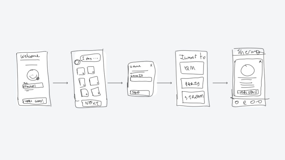
The onboarding process needs to take both these users into account to help them have a quick start in the app and give contextual instructions when using a specific feature. From the business side, our expectations and motivations were to teach users how to use the app with a quick and simple project. To help lead the design of the solution and define the success of the project, four solution guidelines were established. These guidelines and their respective final solution are illustrated below.
Recognize user first
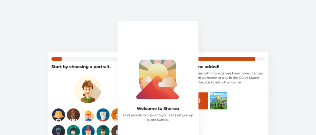
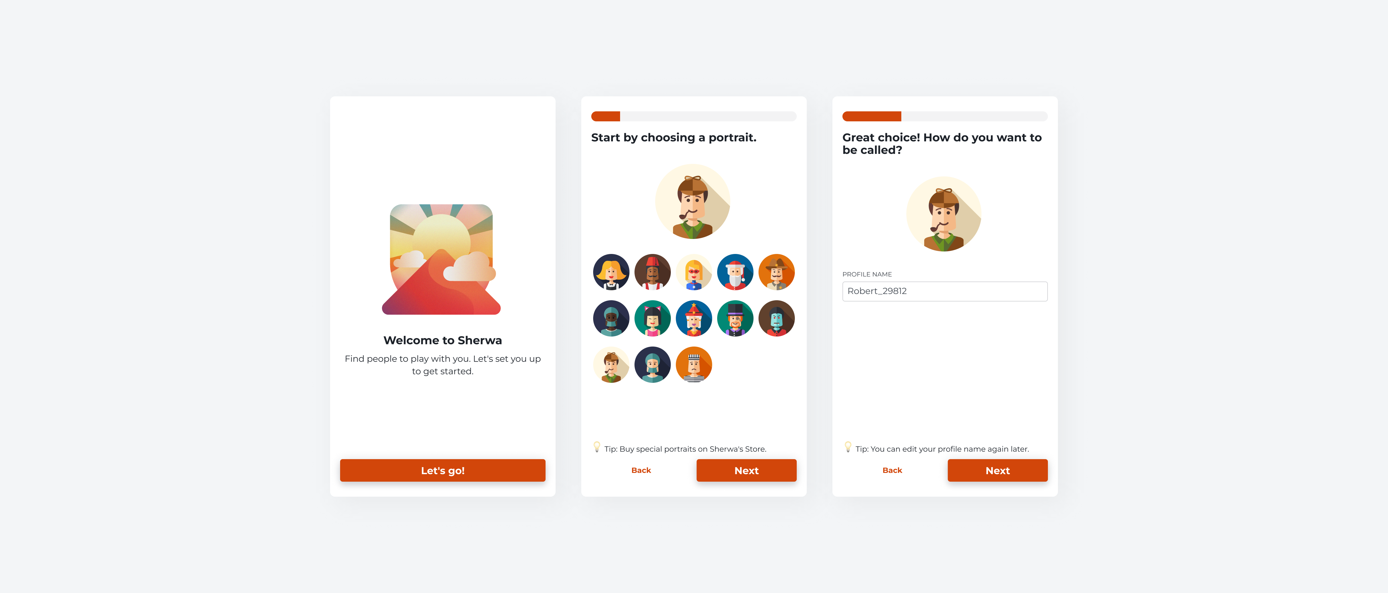
Our current sign-up flow set up a random portrait for users and when users use a single sign-on method, they are assigned a random profile name. Users need to know who they are in the app to understand where they are—therefore, users will choose their own portrait and profile name at the beginning of the onboarding experience.
Offer value with customization
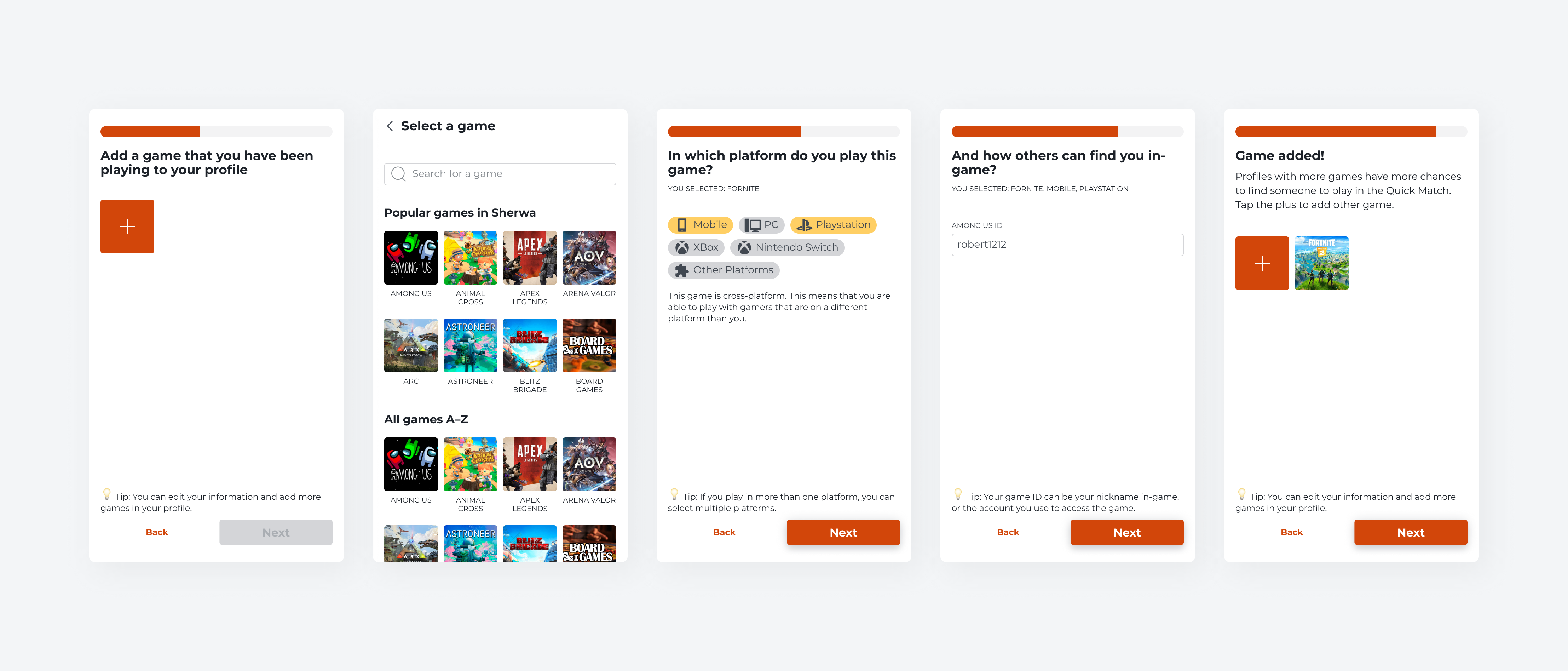
Younger users thought that they could use the app to play or receive games, and this was a frequent problem perceived in our contact messages. To solve that, we will also request users to add at least one game that they have been playing in the onboarding.
Guide by goal
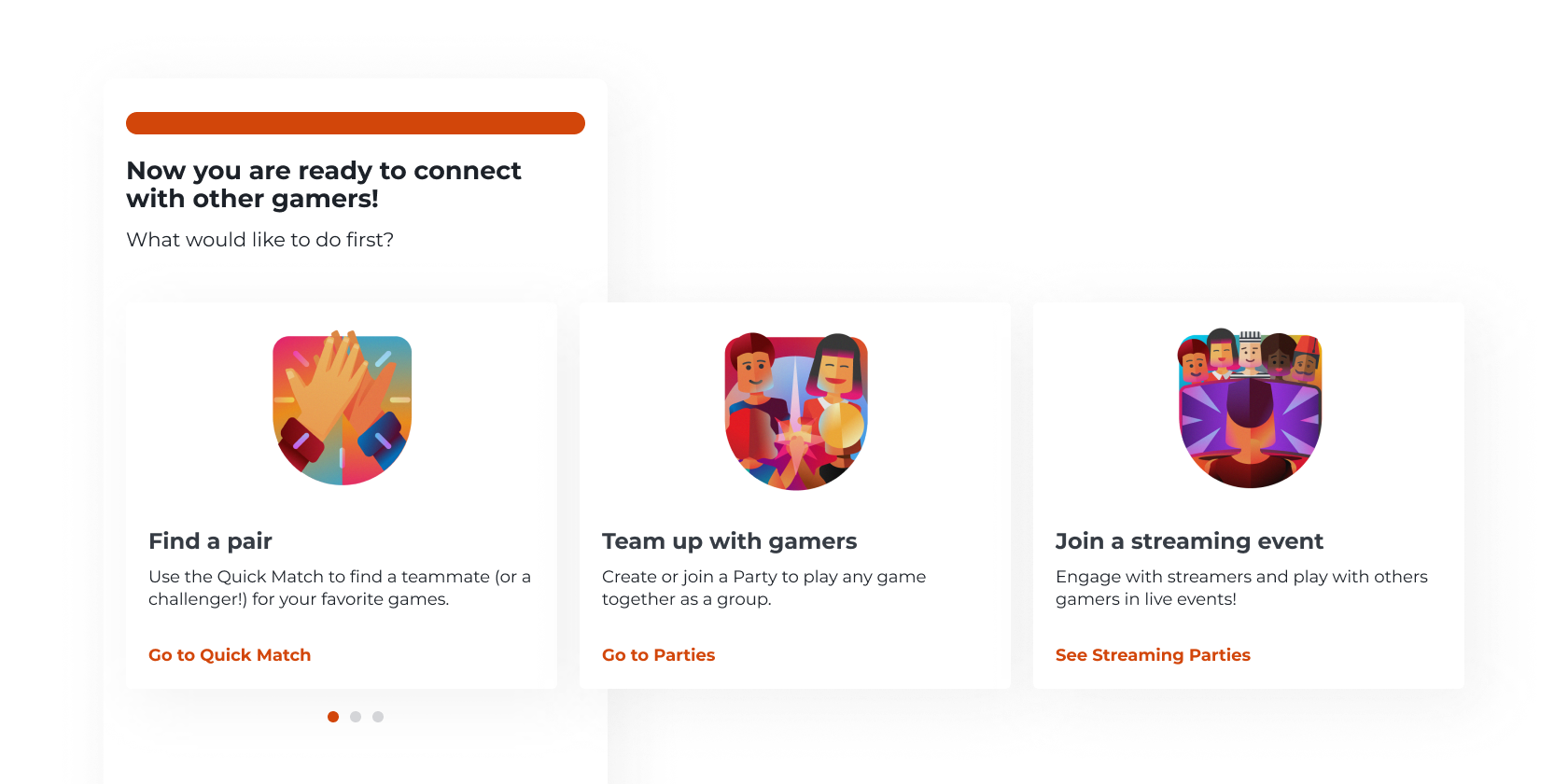
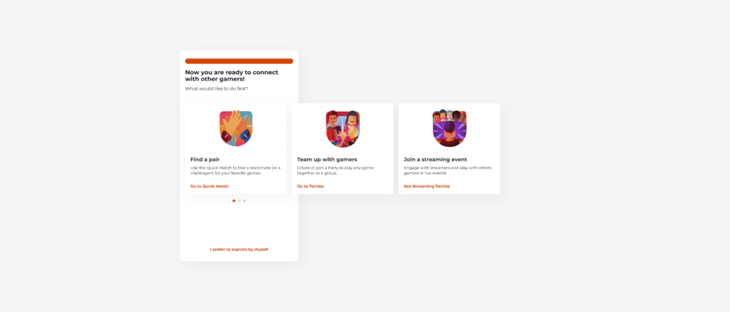
To avoid making the user feel overwhelmed with options on the home page when using the app for the first time, we are offering directions based on the user’s goal to redirect them directly to a feature—but also giving them the option to explore by themselves if they wish.
Feature promotion by context
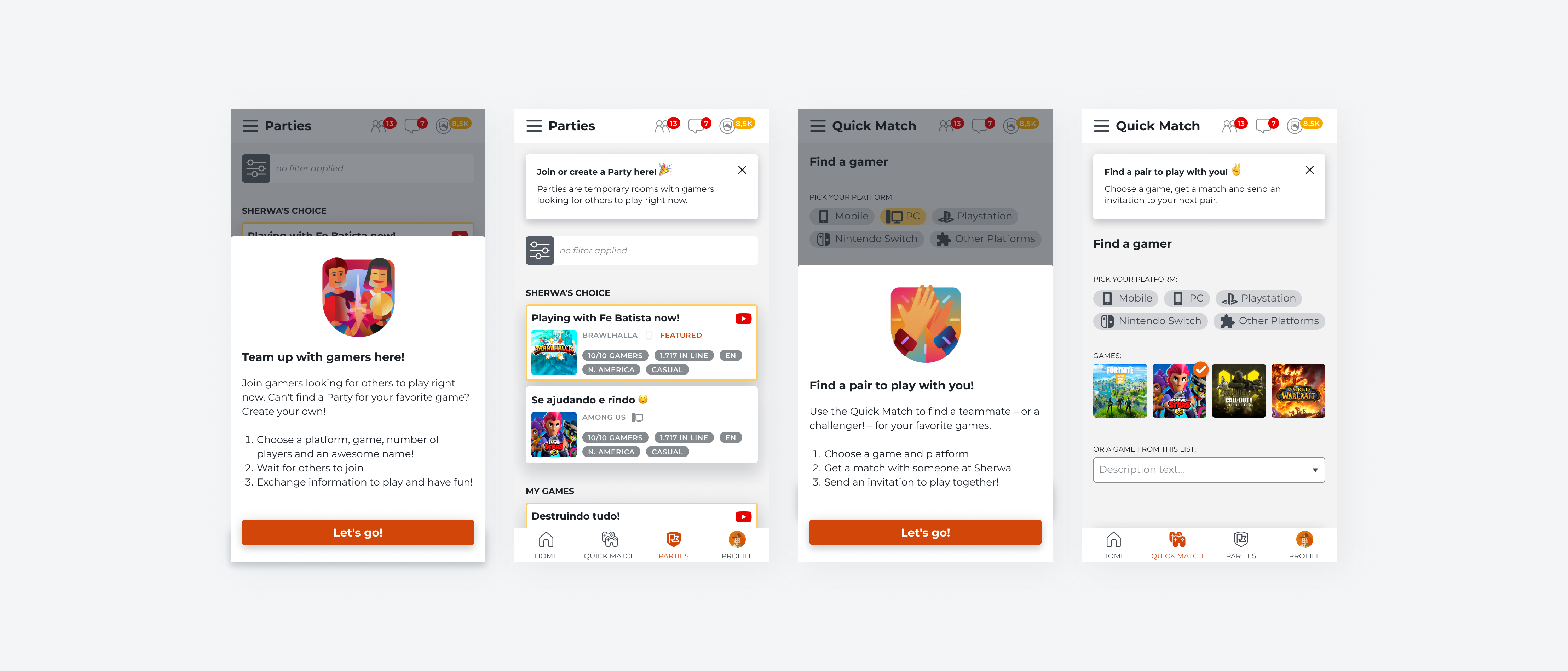
Because users tend to forget about tutorials or even skip them, we decided to introduce information about features in the context of use. Depending on the direction and goal the user chose, they will see different prompts to learn more about the features on the page.
From now on, we are hoping that the onboarding experience helps users to understand how to use the app and the features, and the user’s quality improves over time.
From now on, we are hoping that the onboarding experience helps users to understand how to use the app and the features, and the user’s quality improves over time.

